#poster-intro-head {
    display: grid;
    grid-template-columns: 30% 30% 30%;
    width: 100vw;
    margin: auto;
    justify-content: center;
    min-height: 100vh;
    align-content: center;
}

.poster-intro-content-poster{
    height: 40vh;
    width: 30vw;
    display: flex;
    flex-direction: column;
}

.poster-intro-content-intro {
    display: flex;
    flex-direction: column;
    padding: 30px;
    margin-left: 10px;
    margin-top: 10px;
    background: white;
    min-height: 110%;
    border: 1px solid darkgrey;
    clip-path: polygon(63% 12%, 64% 46%, 84% 46%, 85% 86%, 65% 100%, 0% 100%, 0% 76%, 0% 12%, 24% 12%);
}

.poster-intro-content-intro-text {
    font-size: 18px;
    margin: auto;
    text-align: justify;
    padding: 0px 25px;
    margin-top: 30px;
    letter-spacing: 0.02em;
}

.poster-intro-content-names{
   height: 40vh;
   width: 30vw;
   display: flex;
   flex-direction: column;
}

/* // CLAUDE // */

#poster-intro-head {
  position: relative;
  width: 100%;
  height: 520px;
}

.poster-intro-content-intro {
  position: absolute;
  top: -40px;
  left: 0;
  width: 43%;
  height: calc(100% + 40px);
  background: #fff;
  clip-path: polygon(
    0% 9%, 100% 9%, 100% 83%,
    63% 83%, 63% 100%, 0% 100%
  );
  filter: drop-shadow(0px 0px 0px 1.5px black)
}

.poster-intro-content-intro-text {
  position: absolute;
  top: calc(40px + 1.5rem);  /* offset kompensieren */
  left: 1.5rem; right: 1.5rem;
}

.poster-intro-content-names {
  position: absolute;
  top: 0;
  left: 52%;
  width: 48%;
  height: calc(100% + 60px);
  background: #fff;
  clip-path: polygon(
    0% 0%, 100% 0%, 100% 87%,
    0% 87%, 0% 70%, 27% 70%, 27% 0%
  );
  filter: drop-shadow(0px 0px 0px 1.5px black)
}

.poster-intro-content-names-text {
  padding: 1.5rem 1.5rem 1.5rem calc(27% + 1rem);
}

/* // END CLAUDE // */

/* ─── CONTAINER ─── */
#poster-intro-head {
  position: relative;
  width: 100vw;
  min-height: 100vh;
  display: flex;
  align-items: center;
}

/* ─── POSTER (linke Spalte) ─── */
.poster-intro-content-poster {
  position: absolute;
  top: 50%;
  left: 0;
  transform: translateY(-50%);
  height: 40vh;
  width: 30vw;
  display: flex;
  flex-direction: column;
}

/* ─── INTRO TEXT ─── */
.poster-intro-intro-wrapper {          /* filter-Wrapper */
  position: absolute;
  top: -40px;
  left: 28%;
  width: 38%;
  height: calc(100% + 40px);
  filter: drop-shadow(0px 0px 0px 1.5px darkgrey);
}

.poster-intro-content-intro {
  width: 100%;
  height: 100%;
  background: white;
  display: flex;
  flex-direction: column;
  clip-path: polygon(
    0%   9%,
    100% 9%,
    100% 83%,
    63%  83%,
    63%  100%,
    0%   100%
  );
}

.poster-intro-content-intro-text {
position: absolute;
    top: calc(-39px + 31.5rem);
    left: -18.5rem;
    right: 1.5rem;
    width: 300px;
}

/* ─── NAMES ─── */
.poster-intro-names-wrapper {          /* filter-Wrapper */
  position: absolute;
  top: 0;
  left: 60%;
  width: 40%;
  height: calc(100% + 60px);
  filter: drop-shadow(0px 0px 0px 1.5px darkgrey);
}

.poster-intro-content-names {
  width: 100%;
  height: 100%;
  background: white;
  display: flex;
  flex-direction: column;
  clip-path: polygon(
    0%   0%,
    100% 0%,
    100% 100%,
    0%   100%,
    0%   70%,
    27%  70%,
    27%  0%
  );
}

.poster-intro-content-names-text {
  padding: 1.5rem 1.5rem 1.5rem calc(27% + 1rem);
  font-weight: 700;
  font-size: 14px;
  line-height: 2.1;
}

/*<img src="test_menu-list-01.png" alt="png" style="display: block; position: relative; width: 100vw; height: fit-content;"> 
                     <div id="poster-intro-head">
                        <div class="poster-intro-content-poster">
                            <img src="assets/imgs/POSTER/poster-Berlin_3c.png">
                            <p>issue 1: berlin</p>
                        </div>
                        <div class="poster-intro-intro-wrapper"> 
                        <div class="poster-intro-content-intro">
                            <div class="poster-intro-content-intro-text">
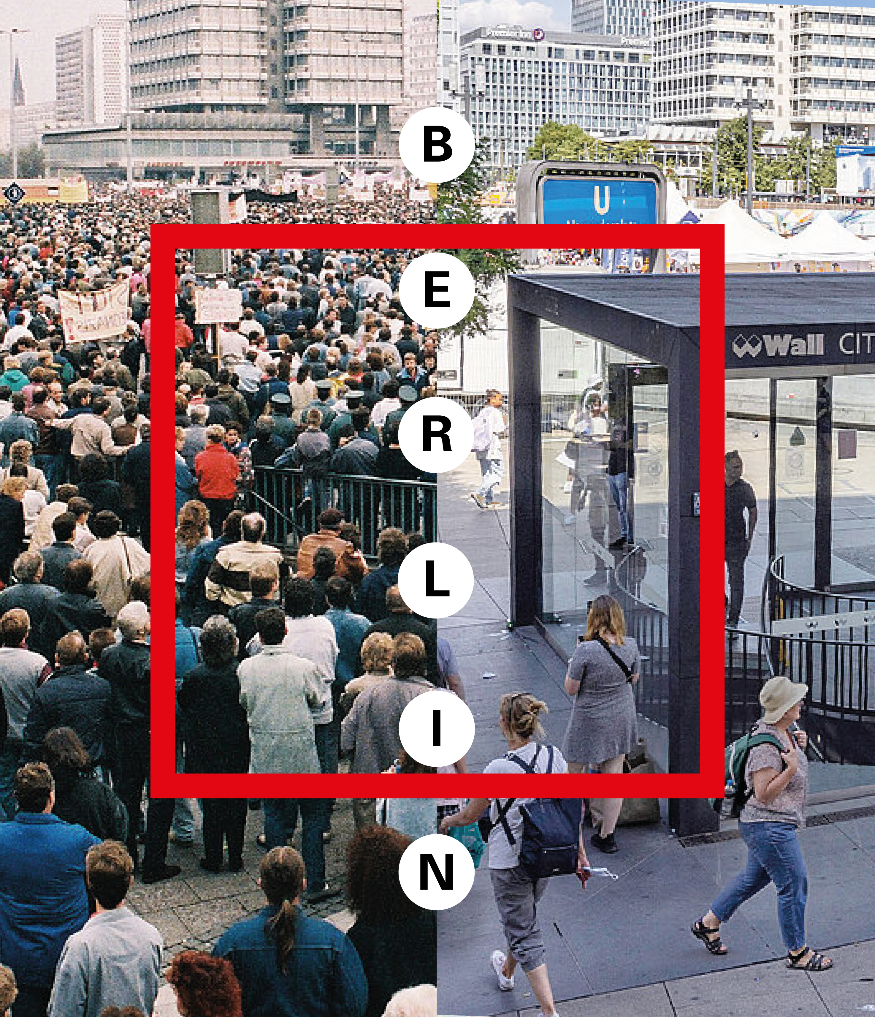
                            The first volume gathers a variety of artists' publications that engage with the city of Berlin. Not as a fixed entity, but as a shifting material shaped through artistic adaptation. In these contributions, the city becomes a site of projection, negotiation, and reinterpretation. Rather than defining Berlin, the works collectively trace an undefined, evolving identity that resists closure. <br><br>
                            By leaving Berlin open-ended, the artists point to the constructed nature of urban character itself: how cities, like communities, are constantly reassembled through perspective, memory, and method. This open form reflects broader social tensions: the ongoing conflict between the desire for coherence and the reality of fragmentation.
                            </div>
                        </div>
                        </div>
                        <div class="poster-intro-names-wrapper"> 
                        <div class="poster-intro-content-names">
                            <div class="poster-intro-content-names-text">
                                Sofia Duchovny<br>
                                Olga Hohmann<br>
                                Tobias Hohn & Stanton Taylor<br>
                                Till Hunger<br>
                                Robert Rauschenberg<br>
                                Aura Rosenberg<br>
                                Gundula Schulze-Eldowy<br>
                                Michael Sullivan & Clemens Freigang<br>
                                Stella Sieber<br>
                                Bruno Taut<br>
                                Lilli Thiessen<br>
                                Amadeus Vogelsang<br>
                                Stephen Willats<br>
                                Frederik Worm<br>
                                Tomomi Yamakawa<br>
                                Schirin Charlot Djafar-Zadeh
                            </div>
                        </div>
                        </div>
                     </div> */